Ecommerce website design is an important element to improve your user experience.
When you’re setting up your ecommerce store, one of the most important things to keep in mind is that your ecommerce web design has an enormous impact on the way your customers perceive your brand.
Consider it this way: an in-person store has its storefront and building facade complete with branded signage to draw attention.
Your ecommerce business relies on SEO (search engine optimisation) to appear in customers’ search results, and then further relies on great web design to pique their interest further.
In other words, excellent ecommerce website design helps you improve your average conversion rate and draw in more customers, among many other things.
Here’s a quick summary of the top seven tips for outstanding ecommerce website design:
Tip 1: Test it extensively
Your web page can’t spring into being overnight. It’s got to be put together piece by piece, and unfortunately, there’s no guarantee that all of those pieces will work seamlessly the first time.
That’s why it’s important to integrate constant testing into the design process for your ecommerce site.
If you have little or no experience with testing, you might be asking yourself questions like ‘what is smoke testing, and why do I need it?’
The answer is simple; smoke testing, like other types of testing, helps you ensure that everything from your homepage to your product pages loads and runs exactly the way it should when customers access your ecommerce platform.
Smoke testing is geared more towards securing basic functionality, however. It’s a necessary step – but it’s also not the only necessary step.
You’ve got to remember that all of your site features need user testing.
After all, testing site elements on groups of users can have hugely positive, and sometimes unexpected results. A/B testing, a type of user testing that involves trying out two versions (versions A and B) of the same website functionality on groups of users, can have very impactful results, as shown in the infographic below.
That’s why regular testing, especially user testing, leads to great designs that are more likely to engage potential customers.
Tip 2: Ensure it’s mobile-friendly
Whether you’re a small business, a startup, or an established enterprise, you’ll always want more customers. That’s why it’s vital to optimise for mobile devices with your ecommerce online store design.
Popular ecommerce platforms like Shopify, WooCommerce, WordPress, and Magento already provide mobile app options for phone users who want to access their sites.
This is a great way to ensure that all of your online shop’s key design elements will render the way they should on mobile. There’s never been a better time to learn how to build an app either, considering that over half of the world’s population uses smartphones.

As you take the plunge into creating mobile-friendly apps as part of your design ecommerce solution, remember that the same rules and design tips apply here as to general website design.
That means focusing on creating a great user experience, choosing user-friendly templates for your design, and always ensuring that your app presents users with high-quality content.
It also means you’ve got to remember to invest time and effort into your app testing process. App testing is just as important as website testing, and we’ve already established how crucial regular testing is for any website builder.
Tip 3: Implement a digital assistant
What better way is there to engage with your target audience than to help them at every stage of their buyer’s journey?
A Digital Assistant can do just this for you, and more. Whether your customers need help finding similar t-shirts to the ones in their shopping cart, or unsure what products to buy in the first place, a Digital Assistant can provide them with the support they need to have a great shopping experience.

Ve’s Digital Assistant has a responsive design that helps customers in lots of different ways, from providing bespoke product recommendations to helping customers find and purchase the right products online with guided selling.
Tip 4: Focus on boosting AOV
Average order value, or AOV for short, is a measure of how much your typical shopper spends when they place an order with your brand. The better your AOV, the more money an average customer spends as they fill their virtual shopping cart at your store.
It’s worth bearing in mind that AOV comes with a lot of variables to consider. For example, it varies depending on which device a given customer uses when they make purchases on your ecommerce platform – and some devices lend themselves to better AOVs than others:
At the same time, AOV is influenced by the sector that your ecommerce company falls within. Customers spend more on particular types of products than others, which means you’ve got to have an accurate and detailed guide to average order value if you want to understand the context surrounding your company’s AOV properly.
Your website design should absolutely take AOV into consideration. If your website doesn’t have a recommendation engine, for example, your customers won’t be as likely to add more items to their shopping carts.
This is another reason why a Digital Assistant, like the one discussed above, is so useful to have on your ecommerce website.
Tip 5: Use affiliate marketing
There are many benefits to putting effort into boosting your affiliate marketing program.
Among other things, affiliate marketing can bring more first-time customers to your website – doubly so if your affiliates include ecommerce giants like Amazon. In July 2020 alone, Amazon saw a 150% increase in the number of affiliate marketing publisher applications, which shows just how popular their site is for this type of approach.
In other words, affiliate marketing is a great way to draw more eyes to your website. By incorporating affiliate marketing strategies into your website design cycle, you can ensure your platform gets exposed to more customers and, as a result, generates more sales.
You can also choose to host affiliate content. This will allow you to earn a commission whenever one of your customers clicks on the banners (or other ads) that you’ve placed on your website for your affiliate partners.
By doing this, you can work passive revenue generation into the design of your website. That means more income for your business, without needing to increase sales targets.
Tip 6: Ensure your sales team is involved and engaged
Your ecommerce website is the platform you’ll be using to make sales. That means your sales team needs to be engaged with the website design process, so they can submit feedback and help you optimise your site to generate more sales.
Do you like this article?
Join our CX for Retail dedicated newsletter!

Stay connected to what’s really important to optimize your digital revenues.
By clicking the button, you accept our Terms & Conditions. Also you will need to confirm your email address.
Certain tools can make this a lot easier for you. For example, a great sales engagement platform will give your sales teams the equipment they need to work as efficiently as possible.
An involved, engaged sales team is a huge asset when it comes to website design because they can help you perfect your category pages, exit-intent popups, product descriptions, and even product images to maximise sales.
If you’re interested in using pop-ups, your sales team can also provide input that will help your website designers create pop-ups that will encourage more sales.
Tip 7: Understand your customers well
You need to know as much as you can about your customers when considering site design. That means you’ve got to understand the customer lifecycle in-depth, as well as learn about their preferences, tastes, and needs as shoppers. This helps your online business stand out and impress customers.
One example of an area in which your business benefits greatly from knowing its customers inside and out is the payment options your store offers on the checkout page. If you know your customers mostly use PayPal, you’d want this to be the first suggestion in your payment gateway.
The more you know about your customers, the easier it is to personalise content to their tastes.
That means offering them special promotions, tailoring your recommendations by which product categories they enjoy, and providing CTAs for products they’ve shown interest in.
Customers that feel you care about them are going to leave better product reviews. They’re also more likely to recommend and promote your brand on social media, which leads to more customers trusting your brand in the future. It’s a good cycle!
Conclusion
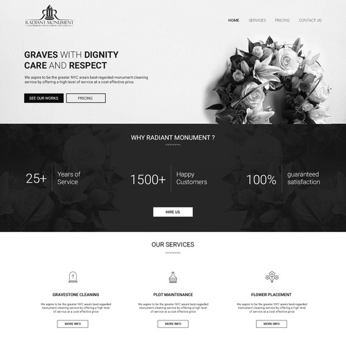
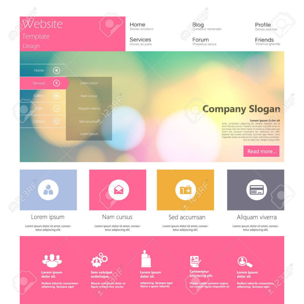
The best ecommerce website examples have a great degree of variety – some might use monochrome palettes, while others opt for bright colours.

However, they all have one thing in common: they’ve got excellent website design that draws customers in and boosts sales.

Your website can stand out among competitors by having outstanding website design.
The tips we’ve covered in this article will help you take your site from ‘good’ to ‘fantastic’, ensuring you get the attention you deserve. They’ll give you a hand when it comes to boosting your site traffic, lead conversion, and overall sales by taking you closer to that ideal website design.

