The marketing efforts that cost your business to acquire both new and returning customers may be put to waste if your customers end up leaving during their checkout form process.
The Checkout form process refers to the user’s interaction with your checkout process when purchasing a product or service from your list of offerings.
As a rule of thumb, your work in trying to win them over and accept your offer doesn’t end once they land on your checkout page. You have to make them complete their purchase!
In fact, the current average shopping cart abandonment rate is 69.9%, which is extremely high. This implies that businesses in various industries are missing out on potential sales due to a check out process that is complicated, confusing, or requires too much effort from the customer.
As a result, your conversion rate would decrease as the customer did not complete the purchase.
Read on to learn more about the benefits of optimizing your customer checkout process and its benefits.
Benefits of Optimizing Checkout Form Experience
Optimizing the checkout form experience for your customers can yield numerous advantages for your online enterprise, particularly in terms of customer retention and overall enhancement of your operations. Some of these benefits include:
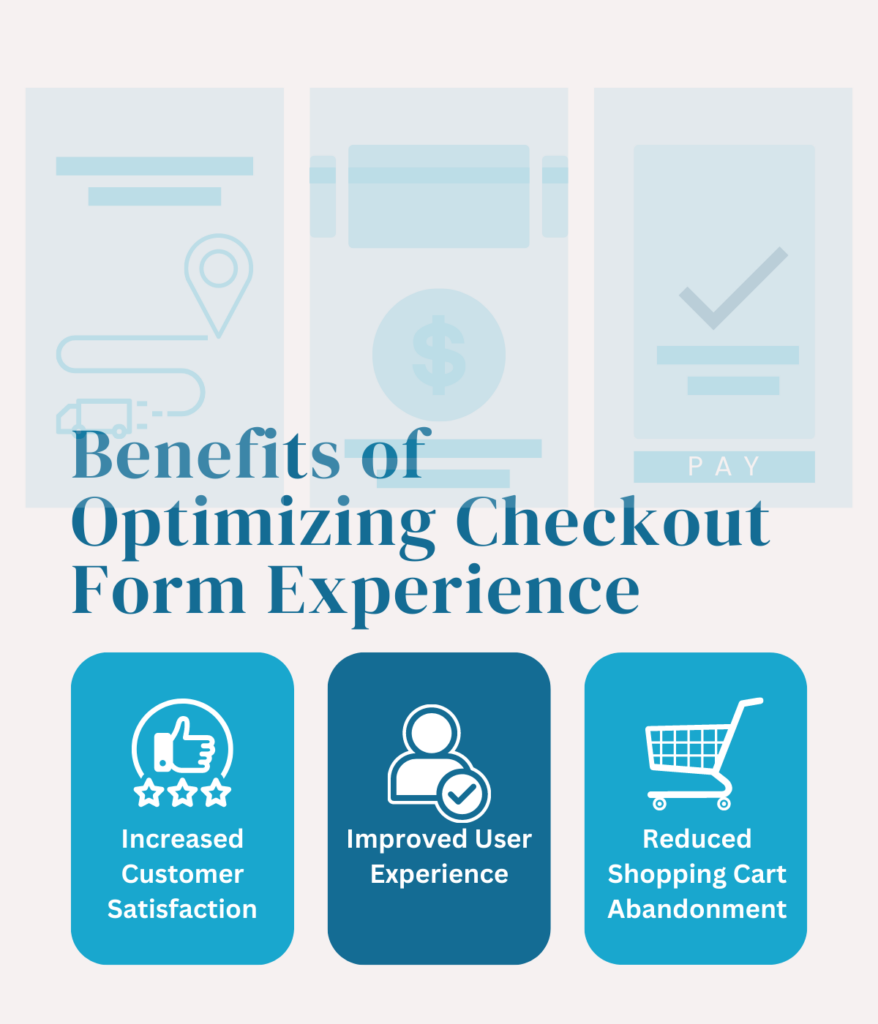
Increased customer satisfaction
Everyone is a lazy shopper. Even you probably hate a complicated checkout process when ordering online. Therefore, you need an easy-to-navigate checkout process.
A seamless checkout experience can increase customer satisfaction by reducing frustration and making it easier for them to complete their purchase. This can lead to a positive impression of your business and encourage customers to return.
Improved user experience
As a business owner, it is essential for you to ensure that your checkout form is not only well-designed but also simple and easy to understand for your customers to find what they need, thereby captivating their interest.
Incorporating auto-fill features can improve your user experience.
You can help customers save time and effort when filling out the checkout form. You can simplify the process and reduce the likelihood of errors by automatically filling fields with relevant information.
Reduced shopping cart abandonment
A complicated or confusing checkout process can cause customers to abandon their shopping carts, leading to lost sales. So what do you have to do?
Well, by simply optimizing the checkout form experience, you can reduce shopping cart abandonment rates and increase the likelihood of completed transactions.
How to Optimize Checkout Form Experience
Now that you understand the good impact and importance of optimizing the checkout form experience, take note that there are several ways you can do to improve including:
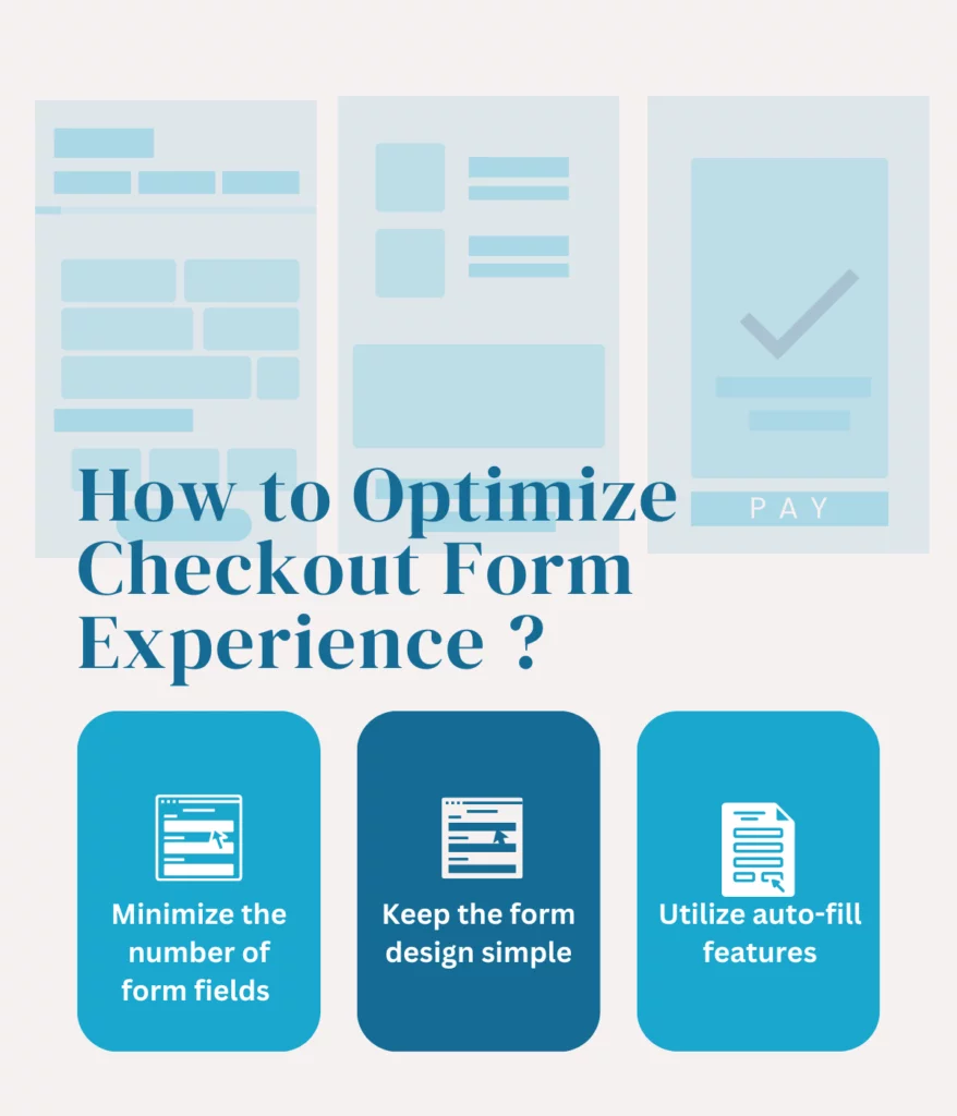
Minimize the number of form fields
A lengthy checkout form can be overwhelming for customers and may result in abandonment. It can also cause annoyance to potential customers, so make sure that you only ask for common details that are necessary.
Essential information includes name, email address, shipping and billing information, and payment details. By doing so, you can minimize the time and effort needed by customers to complete the transaction.
Keep the form design simple:
The goal is to keep the design simple and the process efficient for customers to use.
Overdesigning your checkout form may look good to eyes for some reasons but not to keep potential customers finish their purchase.
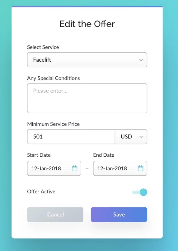
In fact, A cluttered or confusing form design can create a poor user experience and lead to frustration.
You should use a simple and clean design with clear labeling and instructions, making it easy for customers to understand and navigate.
Want to be up to date with Marketing?
Subscribe to our Retail CX newsletter!

Stay connected with what’s really important to optimize your digital revenues.
By clicking the button, you accept our Terms & Conditions. Also you will need to confirm your email address.
Utilize auto-fill features:
The faster the process, the easier for your customers to finish the transaction and reducing the chances of abandoning their cart
Auto-fill features can help customers save time and effort when filling out the checkout form. You can simplify the process and reduce the likelihood of errors by automatically populating fields with relevant information.
Extra Recommendations
As marketers often say, your checkout page is the best place to start from when you are trying to improve your customer experience to maximize the full potential of your sales from them. But to do that, you have to make customers complete all transactions as much as possible.
Here are some additional recommendations for you as an online retailer to optimize your checkout forms:
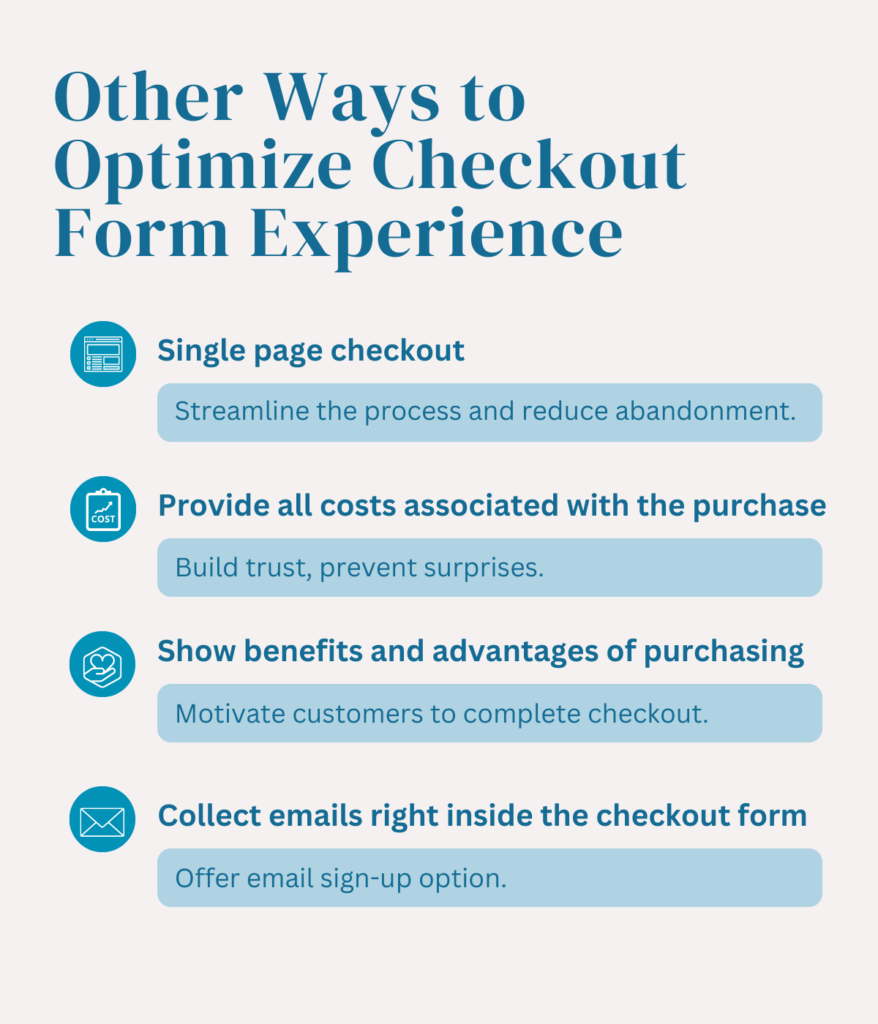
Single page checkout:
When creating a checkout form page, make sure to use only one page on your website that is specifically designed for checkout.
A single-page checkout process can streamline the purchasing process for customers and reduce the likelihood of shopping cart abandonment.
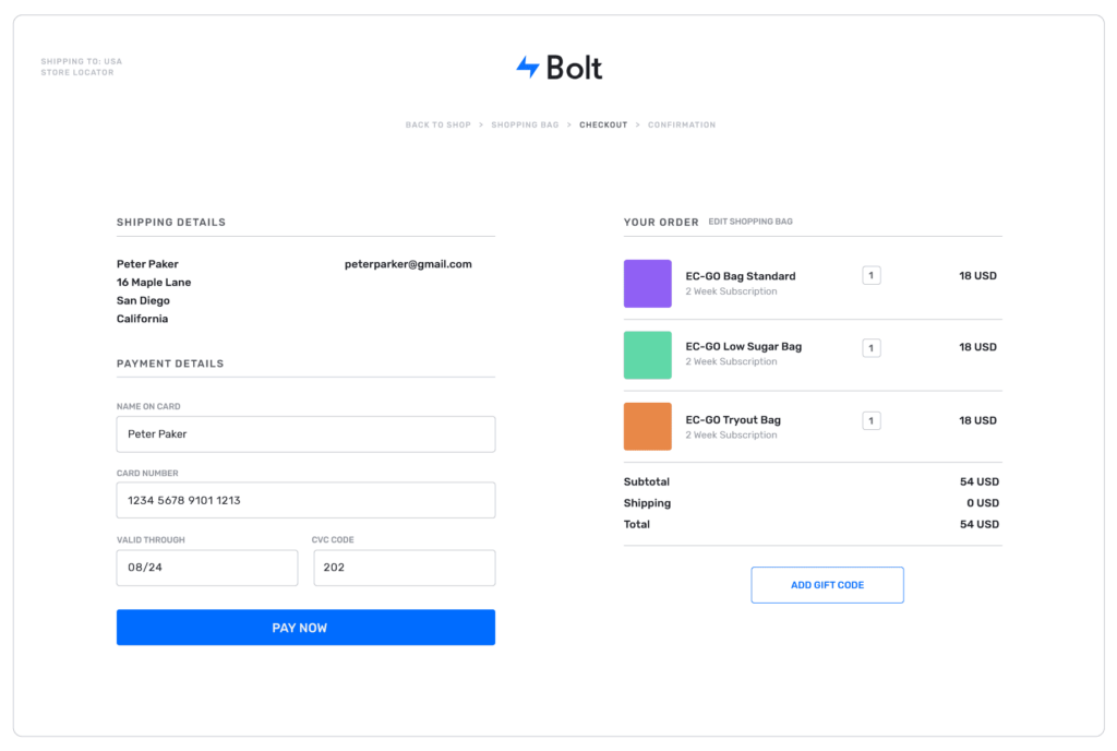
All necessary form fields and payment options must be on a single page so that customers can quickly and easily complete their purchases.
Collect emails within the checkout page:
Do you know that the best marketing channel is email?
This is because most people open their emails daily and choosing the best email marketing automation like Vibetrace can even make things a lot easier for you.
So, collecting email addresses during the checkout process can help you build your email list and provide an opportunity for future marketing campaigns.
Including an opt-in checkbox or a form field to collect email addresses within the checkout page can be an effective way to gather this information.
Provide all costs associated with the purchase
All details and costs associated with your offers must be disclosed or else people will always end up abandoning their carts.
Transparency in pricing is critical for building trust with customers.
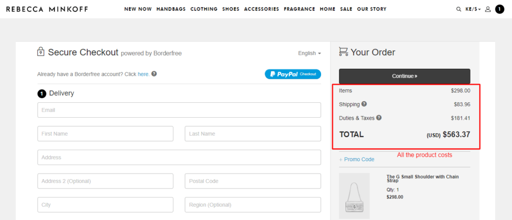
So providing all costs associated with the purchase, including shipping and handling fees, taxes, and any additional charges, upfront on the checkout page can help prevent surprises at the end of the purchase process.
Show benefits and advantages of purchasing:
It’s not just about selling the product, but also conveying how the product can assist customers with their problem. When potential customers comprehend the mission behind the product you offer, it is what primarily captures their interest.
Including a clear and concise message that highlights the benefits and advantages of purchasing can help motivate customers to complete the checkout process.
This could include information about free shipping, a money-back guarantee, or any other perks or benefits of shopping with your business.
Collect emails right inside the checkout form:
To make it easy for customers to sign up for email newsletters or promotional materials, you can include an option to collect email addresses right within the checkout form.
This can be an effective way to build an email list and create additional marketing opportunities.
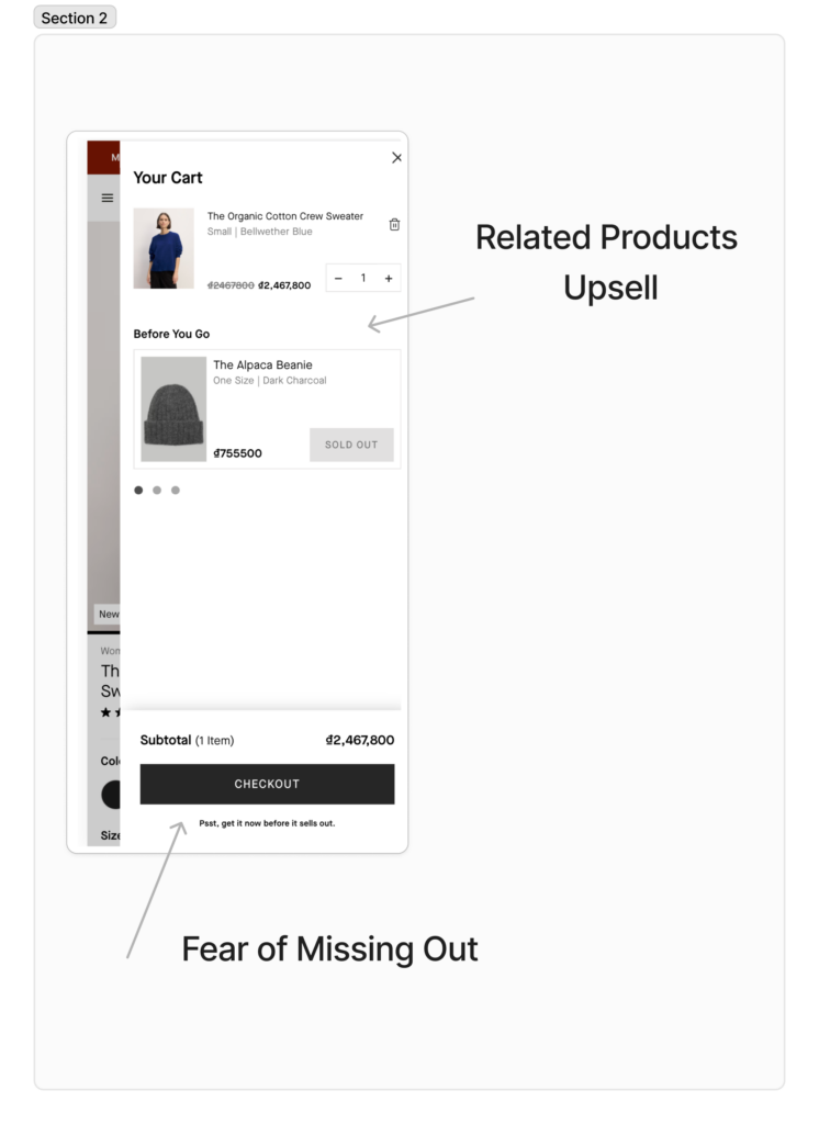
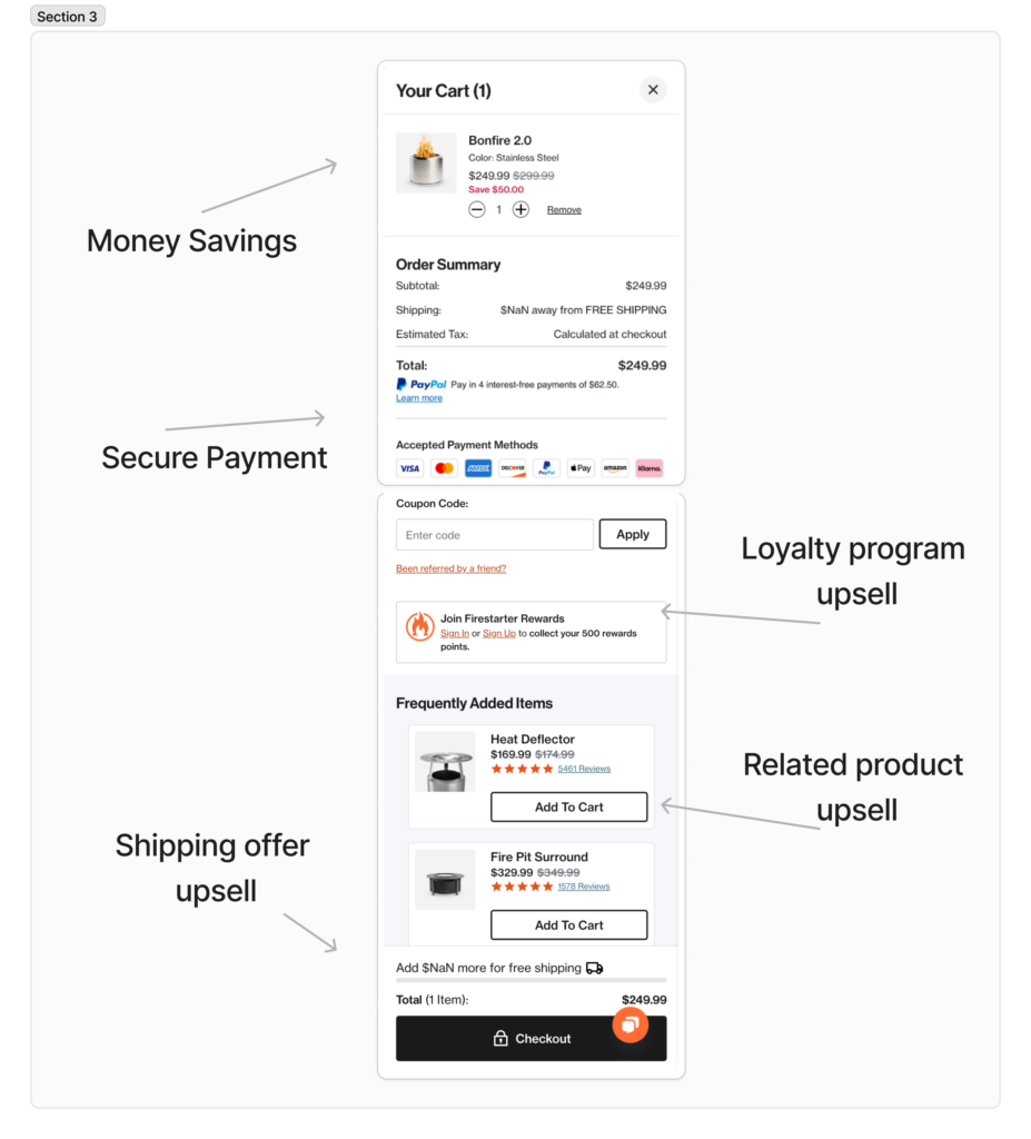
Example of high converting checkout Pages
Some good practices for Checkout Pages:
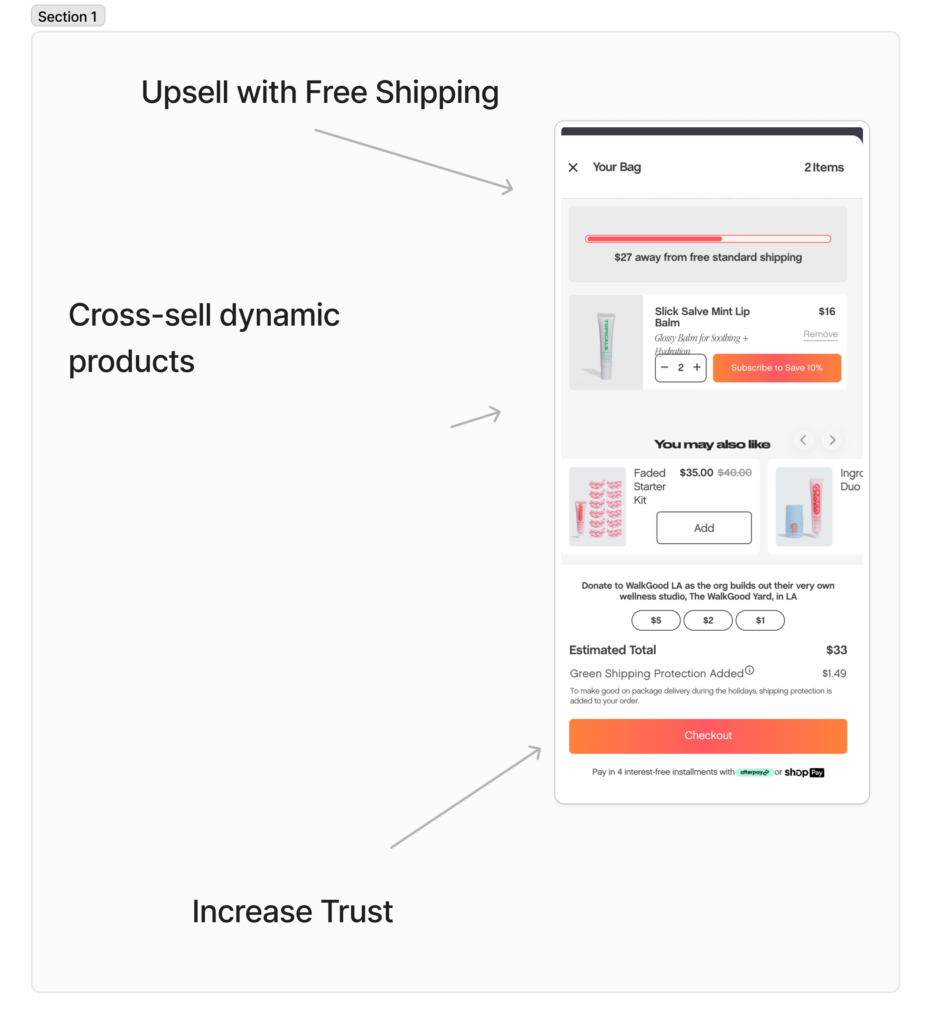
Key Takeaway
Don’t take your customers’ checkout process for granted!
It’s essential to recognize that the checkout process is a critical part of the customer’s overall experience.
The checkout form experience plays a significant role in influencing the conversion rate of your business. A complicated or confusing checkout process can lead to high shopping cart abandonment rates and lost sales.
On the other hand, optimizing the checkout form experience can lead to increased customer satisfaction, improved user experience, and reduced shopping cart abandonment rates.

