Online stores use email marketing as one of the most effective and direct channels to reach their audience.
The best way to do that is to dispatch regular and helpful email content. As an eCommerce business owner, though, your newsletters will compete with dozens of email promotions.
How will you win the fight and get your audience’s attention? We’re here to guide you through designing effective eCommerce newsletters. But we’re all about putting theory into practice, too, so we’ll also share the best newsletters from popular retailers doing it right.
Types of emails in the retail world
There’s a wide variety of different approaches when it comes to eCommerce newsletters. By researching your niche, competitors, audience, and objectives, you can decide on the most targeted types for your business.
Let’s take a quick tour of the most popular eCommerce newsletter types:
- Transactional emails: When consumers take specific actions, such as placing an order or changing a password, they receive transactional emails. They provide confirmation and essential information while reinforcing brand communication.
- Abandoned cart campaigns: These targeted emails are sent to recipients to remind them about items left in their shopping carts. The goal of abandoned cart emails is to encourage users to complete their purchases, thus recovering lost sales.
- Product recommendations: Product recommendations suggest products to recipients based on their browsing history and buying patterns. This level of personalization helps online stores drive more sales.
- Exclusive discounts: Highlighting exclusive and limited-time discounts is an excellent way to generate excitement. Exclusive discount emails incentivize purchases by creating a sense of urgency.
- Customer loyalty program updates: If you have a customer loyalty program, recipients expect you to inform them about important updates, such as their points and rewards. That way, you retain customers and increase participation in your loyalty program.
- New arrival announcements: Introducing new products with your newsletters generates interest and drives traffic to your eCommerce store.
Designing your eCommerce newsletter: Step-by-step guide
eCommerce newsletters are a powerful tool for boosting sales and brand loyalty. Use the following tips to design newsletters that not only captivate readers but also deliver real value.
1. Start with an email template
Starting the design process with a pre-made template makes your life easier by speeding up email creation and ensuring consistency. But first, you need to access the right templates.
You should look for newsletter templates optimized for online stores, with sections for showcasing products or featuring discounts. But, also, keep in mind the purpose of your email.
For example, an order confirmation email will have a different structure compared to a discount email.
Once you select the template, you can customize it with your brand colors, add high-quality images, and include a prominent CTA that directs recipients to the next step.
To do so, it’s important to use fully customizable templates. They should be designed with simplicity as overly flashy or heavy layouts will distract the reader from your core message.
Also, responsiveness is a key factor to consider. You need mobile-friendly templates that have been tested to display great across all devices.
Where can you find newsletter templates that fit all the above mentioned criteria? The answer lies into a robust email template builder. These tools offer an extended library of built-in templates that you can customize to the fullest. And that’s without having any coding knowledge.
What’s more, you can save your own templates and keep them organized under one roof for future use. Imagine the time and effort you save.
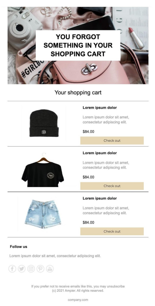
Here’s an example of an eCommerce newsletter template by Moosend that could serve as the basis for creating a targeted cart abandonment email campaign:
2. Add your tone of voice
To connect with your audience on a deeper level, you must establish a unique and consistent tone of voice. Maintaining a consistent tone of voice in your eCommerce newsletters is the equivalent of building a strong brand identity as it’s what will set you apart from your competitors.
Let’s go through some of the most common approaches and their specific characteristics:
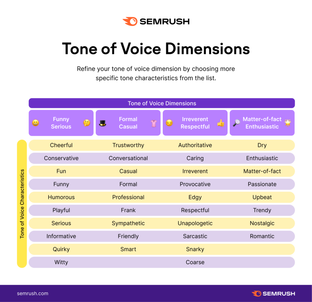
Once you’re clear on your tone of voice, ensure you maintain consistent style and language throughout your newsletters—email subject line to signature.
This principle includes your visuals, too. Elements like your images, videos, or fonts should complement your brand’s tone. So, choose wisely to ensure that they convey the same emotion and style as your text.
For example, if you use a humorous tone of voice, consider writing in a conversational style using puns or wordplay in your subject lines and email copy.
You can inject some humor into your product descriptions and incorporate playful visuals such as funny GIFs or vibrant images.
3. Hook them early
Your ultimate goal is for recipients to read your email and click on your call-to-action. But they have to open it first. Dull, misleading, and uninspiring subject lines won’t do the trick. You should hook them early with compelling subject lines. If it fits your brand tone, let your creativity go wild with clever puns, fun emojis, or pop references.
Do you have a seasonal sale coming up? Are you planning a top-notch webinar? Whatever the best content your eCommerce newsletter features, highlight it in your subject line.
When readers know the value of reading your email beforehand, they have more reasons to open it.
Don’t think that first impressions end with the newsletter subject line, though.
Your email preheader plays a vital role in catching the recipient’s attention, too. Think of it as an element complementing your subject line, providing additional context or a different angle. Always place the most exciting content at the beginning of the preheader so users won’t miss it, especially on smaller screens.
4. Show, don’t tell
Email newsletters should be more than text. That’s even more crucial in the competitive eCommerce landscape, where businesses need to stand out with memorable communications.
Images, videos, and other visual content make your content more engaging while humanizing your brand. As the following video shows, images help us retain 65% of the information shared:
(Source)
This type of content allows customers to visualize how your product or service looks and how it can benefit them in their daily lives. You build trust and credibility when showing actual products or real customers using them.
You can also use YouTube videos to have recipients embark on your brand’s journey. Invite them to meet the founders, let your team share personal stories, and inspire them through your values.
Another option is to use videos or images to provide digestible step-by-step guides. For instance, a brand selling indoor plants could share a repotting video tutorial, giving advice on how to choose the right pot, prepare the soil, and so on.
5. Keep your message short and sweet
Your recipients will spend no more than a few minutes or even seconds reading your newsletter content. So, it should be both easy to consume and meaningful. Keep your message short, concise, and to the point.
Cut to the chase from the first few lines, highlighting how your newsletter addresses potential pain points.
It’s important to use simple language that subscribers can understand and relate to, avoiding wordy phrases and jargon. Some readers will just skim your newsletter, so hook them with short sentences, bullet points, and bold text that help them quickly grasp key points.
Lastly, always proofread and edit your email to remove unnecessary details and errors.
6. Consider accessibility
Did you know that dyslexia affects 9-12% of the global population? Or that almost 300 million people worldwide are color-blind? This is the main reason why accessibility should be one of your first thoughts when designing eCommerce newsletters.
An accessible newsletter ensures that every user can access and grasp every element of your email. Email accessibility doesn’t just ensure all recipients receive the same experience, but also drives better results.
And it makes sense since reaching a wider audience leads to increased conversions and engagement.
But what does creating accessible newsletters include? These are the most essential accessibility standards to keep in mind:
- Organize your newsletter content in a clear structure, with proper headings, bullet points, and appropriate line spacing.
- Follow a logical order in the information shared for assistive devices to read newsletter content effectively.
- Add informative and contextual alternative text to convey the message of your images to users with visual impairments.
- Use accessible font styles and sizes to enhance readability. Consider Arial, Verdana, or Helvetica and a font size between 14 and 16 px.
- Select your color palette wisely by testing different color combinations for accessibility.
Include social proof
Statistics show that the number of consumers trusting other consumers when making purchase decisions keeps increasing:
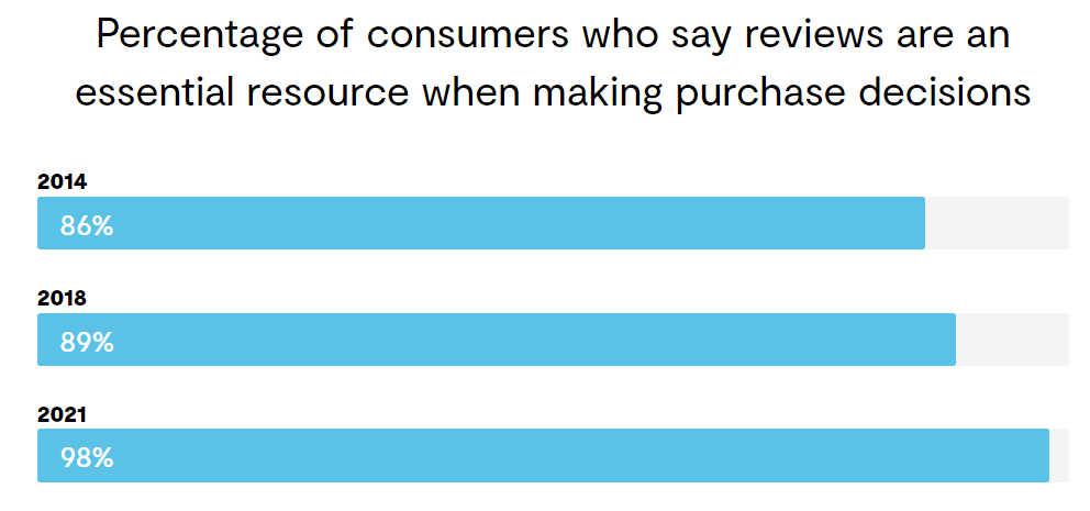
What they’re looking for is other buyers’ assurance that your product or service is worth their money. That’s where social proof comes into play.
Be smarter and include social proof in your eCommerce newsletters, to add authenticity to your messages and build trust.
The most common social proof elements to use in your emails include:
- Reviews and testimonials. A highly effective method to promote your online store is by sharing positive customer reviews and testimonials. Incorporate text reviews or star ratings beneath featured products in your emails. Video testimonials are even more impactful in persuading recipients to take action. Stick to a few reviews and use an email CTA to direct subscribers to a dedicated page for further reading.
- User-generated content. UGC is one of the most popular content types, and for good reason. When consumers see satisfied customers praising your product or service, they envision themselves enjoying a similar experience. Consider using your newsletter or social media to host a UGC contest, offering a small prize to randomly selected winners.
- Case studies. This kind of social proof provides real-life examples of how people have benefitted from your product or service. Success stories offer readers detailed insights into the practical application of your offerings and specific results achieved.
4 eCommerce newsletter examples and why they work
Now that we’ve covered the best email practices to design memorable eCommerce newsletters, it’s time to fuel your inspiration.
That’s why we gathered our favorite eCommerce email examples and the reasons why we loved them:
Supergoop’s newsletter
Subject line: Meet your moisturizer match 💛
(Source)
Why we loved it:
- Supergoop’s newsletter has a clear and visually appealing design, using a combination of text, images, and white space.
- The tree diagram adds a playful touch to the newsletter while catering to a diverse audience with different skincare needs.
- The email subject line and headline clearly indicate what readers should expect from the content. And that’s addressing a common skincare problem, which lures readers in.
Surreal’s newsletter:
Subject line: You’ve got Surreally good taste 👌
(Source)
Why we loved it:
- Surreal uses its brand colors throughout the newsletter; and we can’t help but love the eye-catching combination of coral and mint.
- The clever pun that includes the brand name in the subject line, the playful headline that evokes curiosity, the entire email copy from start to finish—each of them aligned with the humorous tone the brand is known for.
- The five-star customer review adds credibility by confirming the excellent flavor of the product.
- Both CTAs use simple, clear, and actionable language to prompt immediate action.
J. Crew’s newsletter:
Subject line: Thoughts?
Making Every eCommerce Newsletter Count
Whether you own a brand-new online store or an established eCommerce business, email marketing should be a top priority for you.
Great newsletters are captivating, on-brand, accessible, and to the point. However, your work doesn’t end there. Following up when needed is equally important.
After sending your newsletters, track recipient engagement closely. Monitor metrics like open rates, click-through rates, and conversions. This process helps you identify segments who haven’t engaged with your emails and create follow-up messages tailored to their interests or behaviors.
Following up allows you to nurture relationships with subscribers, address potential concerns or questions, and increase the likelihood of conversions. Use follow-up emails strategically to provide additional value, showcase new products or promotions, or remind recipients of limited-time offers.
After all, the success of eCommerce newsletters goes hand in hand with building lasting relationships.
Author

Maria Fintanidou works as a copywriter for email marketing automation software Moosend,
having created the Help Articles (FAQs) and overseen the platform’s translations in Greek and Spanish. She loves exploring new cultures and ways of thinking through traveling, reading, and language learning.

