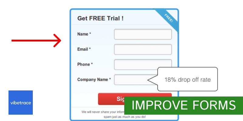
If you’re a business owner or marketer, you probably already understand the importance of optimizing your website forms to collect essential customer information and drive conversions.
However, in a crowded marketplace, standing out from the competition can be challenging especially today.
In this article, we are presenting 7 effective tips to help you create high-performing forms that will make a positive impact on your bottom line that has been proven true over the years.
So, let’s dive in and explore the best practices for creating store forms that convert with maximum efficiency.
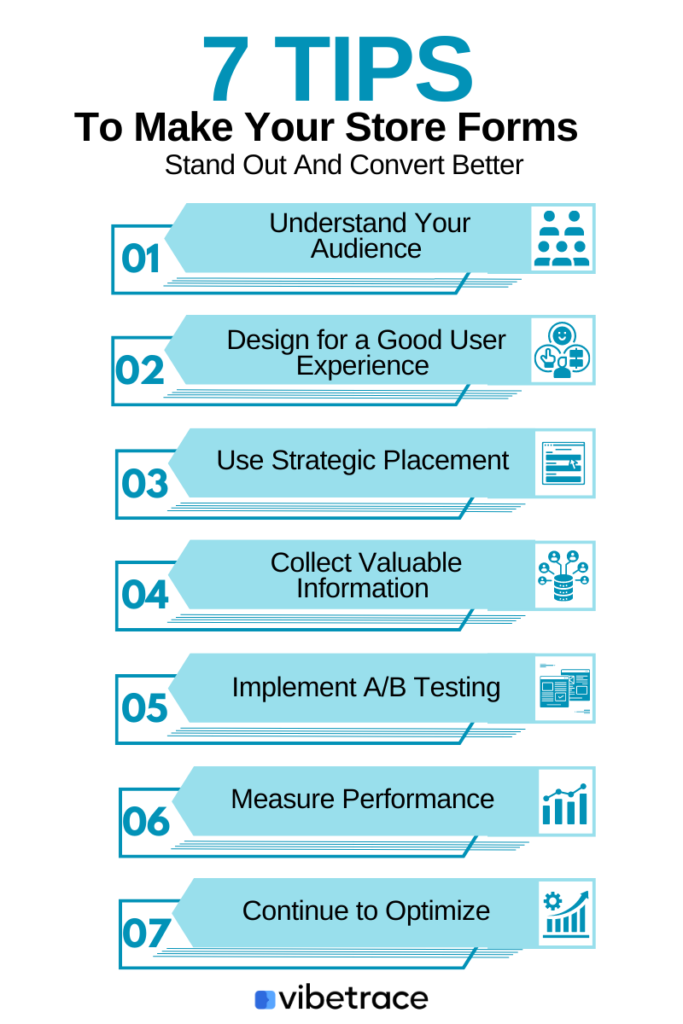
Understand Your Audience
Your audience’s needs are the most critical factor to consider when designing your website forms, as they are the reason you decided to promote your product in the first place.
You must identify which features matter most to them so you can tailor your forms accordingly.
While it’s always advisable to use a clean and simple design, you should also consider the specific preferences of your target audience.
For example, if your audience comprises girls who love fashion, clean backgrounds with images can help your forms stand out, with use of colors for various form states to make it easier for them to identify the messages.
Additionally, it’s important to maintain a professional tone when presenting sign-up forms to demonstrate your expertise in fashion.
Design for a Good User Experience
Designing a good user experience isn’t just about having attractive and visually appealing pop-up forms. It’s about creating forms that are complete, easy to understand, and intuitive to use.
There are at least 2 types of forms:
- embedded in the website real estate
- added within popups or messages that appear on specific user conditions
In simple terms, “When it comes to designing for a good user experience, the forms on your website play a crucial role.”
This is because a well-designed form can significantly impact your form conversion rate and overall user satisfaction. Also, if you’re looking to collect more information from your visitors then it’s really important to focus on form conversion rate.
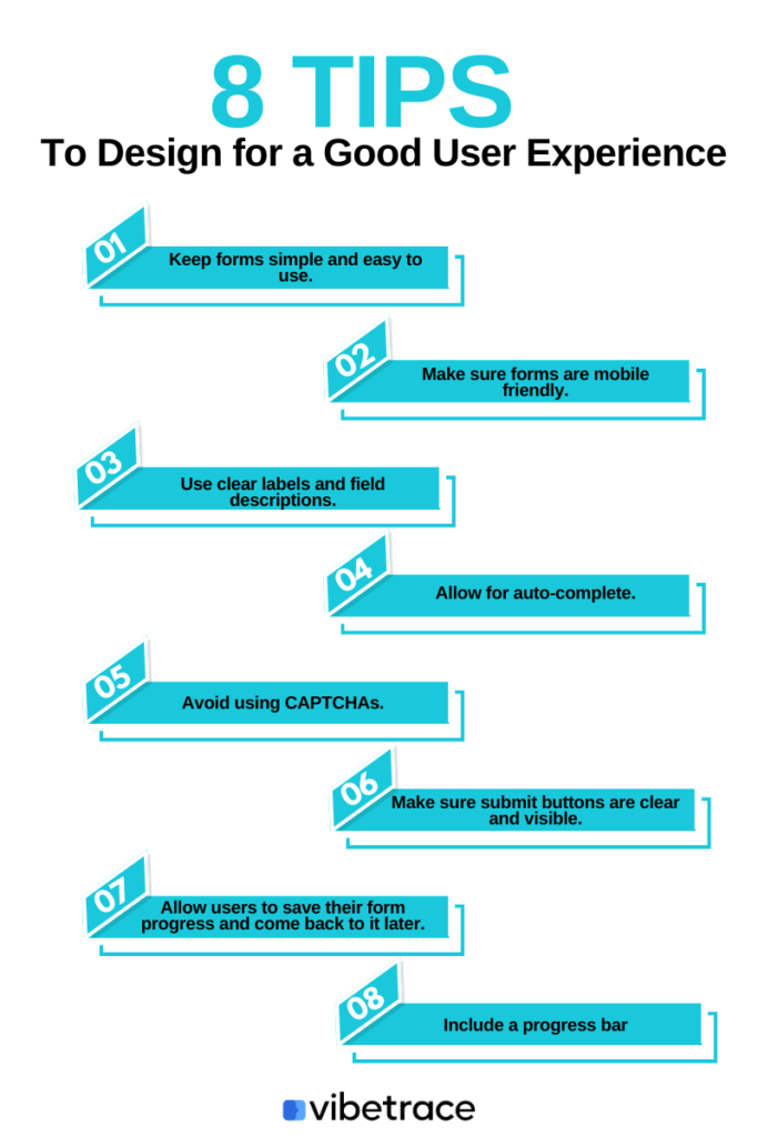
Furthermore, a good user experience consists of several elements that should be included in your form creation checklist.
Here are a few things you need to keep in mind to create effective forms for your eCommerce store:
1. Keep forms simple and easy to use
Users are more likely to complete forms that are simple and straightforward. Avoid asking for unnecessary information and use clear and concise language.
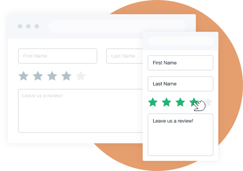
2. Make sure forms are mobile friendly
With more and more users accessing websites on their mobile devices, it’s essential to ensure that your forms are optimized for mobile use.
3. Use clear labels and field descriptions
Labels and descriptions help users understand what information is required and how to fill out each field.

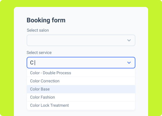
4. Allow for auto-complete.
Autocomplete features help visitors fill out forms quickly and accurately. Additionally, autocomplete features can save users time and reduce errors when filling out forms.
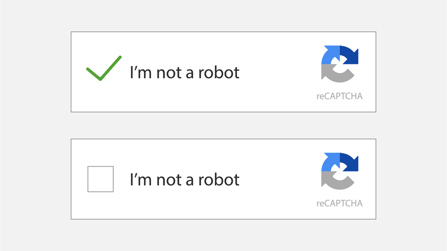
5. Avoid using CAPTCHAs.
While CAPTCHAs can prevent spam and bots, they can also frustrate users and hurt the user experience. Read here a more detailed article on using captcha with webforms.
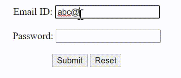
6. Make sure submit buttons are clear and visible.
The submit button should be easy to find and stand out near the form. There are cases where the submission button is close to the clear button (which will reset the form) and frustrate users that all their work was lost.
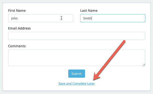
7. Allow users to save their form progress and come back to it later.
Allowing users to save their progress and return later can increase completion rates and improve the user experience.
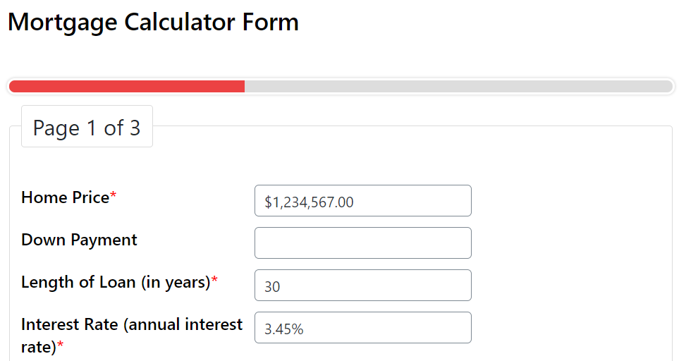
8. Include a progress bar to show users how far along they are in the form.
A progress bar can help users understand the length of the form and provide a sense of accomplishment as they complete each section. This is especially helpful with multi-step forms.
Best Placement for website Forms
Strategy is very universal from your business marketing down to the smallest details for your website forms.
Placing your store forms in the proper placement can make a significant difference in your conversion rate. Ensure that your forms are placed in a visible and accessible area of your website, preferably above the fold.
To add up more to its appearance, use eye-catching design elements like color and contrast to make the forms stand out.
Lastly, make sure that you don’t forget exit pop-ups so that users won’t end up leaving your website.
Implement A/B Testing
A/B testing allows you to compare two versions of your store form to determine which one performs better. To do this, here are two things you must consider:
Test different versions of forms
Create different versions of your forms and test them to see which performs best. You may also seek feedback from your users to know which they like better as they can provide you with suggestions on what they think is best for your store.
Analyze results to optimize conversion rates
Analyze the results of your A/B testing to optimize your forms for higher conversion rates. For sure, there will always be that one form most of your users would pick so choose whichever fits what they require.
Do you like this article?
Join our CX for Retail dedicated newsletter!

Stay connected to what’s really important to optimize your digital revenues.
By clicking the button, you accept our Terms & Conditions. Also you will need to confirm your email address.
Measure Performance
Measuring the performance of your store forms will help you determine which ones are working well and which ones need improvement. In order to do that you can measure your business performance in the following ways:
Track key metrics
Monitor key metrics such as conversion rate, form completion rate, and bounce rate to identify areas for improvement. Metrics are essential but don’t overload yourself with tracking so many metrics which are not useful. Keep an eye on at least 3 to 5 metrics that will guide you with your decision.
Monitor customer feedback
Keep an eye on customer feedback to identify any recurring issues or suggestions. These feedbacks are constructive criticism that will help you in the long run.
Respond to customer feedback
Respond promptly to customer feedback and take action to address any concerns or suggestions. The more you acknowledge these things, the more chances for you have to retain your customers.
Continue to Optimize
Optimizing your store forms as most marketers say is an ongoing process. Use the data you collect to make informed decisions about how to improve your forms continually.
Test new variations, analyze the results, and make changes as needed to ensure that your forms are always performing at their best.
You must also bear in mind to regularly visit your store forms and how well everything works so you can adjust it according to your customer needs.
Lastly, your customer’s feedback is a chance for you to leverage and make improvements to further convert more visitors.
Let’s Wrap It!
Now it’s your time to put all these tips into practice!
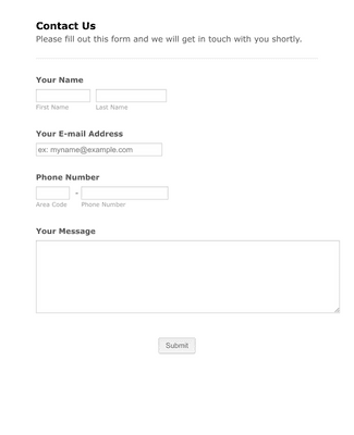
What do you think about this form?
Creating effective and well-designed forms is an essential aspect of running a successful e-commerce store. With all these tips, you can improve your form conversion rates and ultimately increase your sales.
If you’re looking for more ways to optimize your e-commerce business to the next level, consider trying Vibetrace.
With Vibetrace, you can automate your email marketing campaigns, personalize your messaging, and track your results to optimize your strategy. Sign up for Vibetrace today and start seeing results!

